Showing posts with label contrast. Show all posts
Thursday, 4 December 2014
Thursday, 27 November 2014
Wednesday, 12 November 2014
Contrast Location Work Diary
We were set with the task of capturing contrast within the environment around us. I found this to be an interesting topic because it would allow me to experiment in multiple ways with different elements and subjects. The environment that i worked in offered a good amount of variation between the types of pictures that i could get. Overall, I was able to experiment with contrast in a number ways like through the use of people or nature or other features. I was also able to take advantage of the location in order to show contrast on different scales that I could not achieve within the studio.
This picture shows contrast in a few ways. We can see contrast in size as the objects grow smaller and smaller as the image progresses. Contrasts in colour can be seen as the objects differentiate between lighter and darker colours. Brand contrasts can be seen which provide different logo designs which compare in different ways. There are also contrasts of old and new within the image as each object shows a different state, with the wrapping torn compared to perfect condition. A lot of contrast types can be taken from this image as a result of the variation within the image.
This image focuses on one main theme of contrast. The contrast can be seen within the grass and the pavement. The green colours in the grass are enhanced in this picture against the dull bricks and causes the contrast to become clearer as a result. The colour green offers connotations to good and healthy while the colour of the grey bricks offer connotations of old and vacancy. The formal element pattern can be seen within the image due to the lines of the brick work. Contrasts in texture can be seen within the image, the brick appears rough while the grass appears soft.
Progression:
I found this task to be quite successful but if i were to do it again i would have taken more pictures and tried to vary the ways in which i conveyed tone through my work by looking at other methods or techniques, such as emotional contrast.
Wednesday, 5 November 2014
Image Bank Contrast
These two images use contrast to create a more visually striking image. Both of the images use a black and white filter in order to highlight the black and white contrasts of the image. The result of this causes the person or object within the image to stand out to the audience.
In these pictures it is clear that contrast can be shown through different forms. Contrast in colours can be expressed physically or through alterations to the images. Coloured images tend to to have a variation in the vibrance of colours while black and white images use shadows and dark colours to enhance the subject of the image. Variation can also be seen through people and environments. Pictures above can be seen with a contrast of people in different clothing, and in patterns in contrast to a smooth surface. All of these methods can be used to highlight differences and can also be used to exaggerate the subject of a photo by getting the audience to focus on one aspect of the image.
Definintion post Contrast
Definition:
-The state of being strikingly different from something else in juxtaposition or close association.
Describing Words: Opposite, Opposing, Variation, Diversity
Personal Definition:
-The exact opposite of something
This photo shows contrast in the form of colour. The use of a vibrant colour in a dull background causes the audiences eye to focus on one specific part of the image. This is also exaggerated by the use of focus that blurs out the background and causes the flower to stand out more.
This image shows contrasts in life. The photographer has used exact opposites in size to show contrast. The differences are extremely noticeable due to similar plain backgrounds and opposite poses.
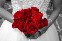
This image shows contrast that has been edited into a photo. The flowers have been enhanced by the use of a black and white background which causes the audiences eyes to focus on that specific part of the picture due to the contrast in colours.
This picture shows a contrast in both colour and subject, The flower stands out because it is the only one of its kind that is visible within the frame. This is further enhanced by the contrast in colours as the red is immediately more vibrant than the green.
Studio Contrast Work Diary
We were set with the task of photographing contrast in the studio. I went in with a number of ideas that i had in relation to the topic but i became very limited within the studio environment and found it quite difficult to portray it. I was still able to get a reasonable amount of pictures with a good variation in things like gender and height along with getting more experience with the studio. I was able to make the images more visually interesting by including some formal elements such as depth, colour and pattern.
This image shows contrast in an interesting way. The shot is composed in a way where one person fills most of the frame with her face while the other fills the frame with her body and it shows an obvious contrast in distance as a result. This image shows the formal element of depth. This is achieved by having someone in the foreground of the image and someone in the background and comparing his the appearance differs over different distances. The darker tones of the clothing create contrasts between the background, causing the people to stand out within the image.
This image shows a couple examples of contrast. The image features contrast in gender by showing two girls and one boy within the image.Height is shown by having the women standing and the boy sitting, this can also be interpreted as to showing power as a result. There are contrasts of emotion within the image through the expressions on the people's faces. The dark clothing and bright hair colour create contrasts against the light background. This causes the people to stand out within the image.
Progression:
If i were to do this again i would think more about the environment that i will be shooting in when thinking about the photos that i want to take. I would also like to still achieve the good variation in pictures while obtaining a larger amount than i was previously able to achieve. The studio has allowed me to consider different backgrounds and the way that they can be used in order to show contrast in interesting ways.
Monday, 3 November 2014
Subscribe to:
Posts (Atom)