Sunday, 30 November 2014

Walk 1, Work Diary


We were set the task of photographing autumn colours, back of heads and journey whilst on a group walk around to multiple locations. This was unusual at first because we had never done anything as a big group before and I did not know the locations that we were going to be taking pictures in. I found this easy to get used to once I thought about what I wanted to achieve with my images. The variation between locations allowed for some very interesting results and i was able to use road signs to show journey and the forest area to represent autumn colours.


I chose this image mainly because I like the way in which the light is cast across the surface of the tree to show the texture. The enhanced detail also allows us to see some depth in the image as the detail slowly fades. The use of form within the image enhances the textures of the trees. This is achieved as the light is cast across the surfaces of the trees, creating shadows which cause the texture of the tree be more prominent. The intense light creates a contrast within the dark shadows and the bright light. This causes more attention to be pulled towards the more detailed areas of the images.


I chose this picture because of the interesting way in which it shows journey. I knew while taking this image that I wanted to imply the sense of journey. I achieved this by focusing on the shoes as they give the audience some insight as to where they have been and where they are now. Contrasts on the shoes can be seen as the dirt on the shoe clashes with the white colours. This causes the audience's attention to be purposely be directed at the shoe and question where the person has previously been.

Progression:

I thought this was an overall good first attempt. My only hopes if I were to do this again would be to not focus on specific subjects and instead share the focus between all themes. This can be seen in this example where I focused on autumn colours and journey mainly and devoted less attention to back of heads. This walk has showed me the importance of expanding the search for better photographs to wider areas in order to achieve a wider range of image variation.

Thursday, 27 November 2014

Mapplethorpe Location straight images


Walk 2, Straight Images


Walk 1 Straight Images


Straight Images Contrast Location


Robert Mapplethorpe Portraits Image Bank


Both of these images use different formal elements in the form of a portrait. The black and white filter highlights the contrasts within the image and causes the audience to only focus on the person within the image. Light and shadow is used in order to highlight the detail of the person within the image, revealing facial features and wrinkles.


Robert Mapplethorpe uses different and interesting methods in his portraits. He positions his subject in a number of ways within the frame in order to produce interesting results. His close-ups of the face are used to show great detail in the faces of his subjects and he uses them to change the mood of the images. Props and clothing can be used to reflect different aspects of the subject, for example a cane will make a subject appear more powerful, while the use of casual clothing will make the subject appear more youthful.

Sunday, 23 November 2014

Connecting Essay 2


This is an image that I have found on the internet. This image features a pathway that goes far into the distance and to a small town. Depth can be seen as a striking factor in this image. The pathway appears to become smaller over a long distance. The pathway also seems to carve its way through the natural background, creating a contrast between these elements. We can see a clear contrast between nature and man made structures. There is also a contrast within colours due to the nature in the image being represented through colours of green and blue, while man-made environments and structures are shown to have brown, grey or white colours. 


This is an example one of my photos. This image shows a brick wall that is accompanied by a backdrop of nature. There is a focus on depth in this image on a small scale as it shows the wall appear to become increasingly smaller as the distance increases. There is also a large focus on contrast in the image between nature and man-made structure. This is shown as the wall is a main focus in the image but the background is consumed by a large amount of nature from trees to bushes. This contrast in the two elements give the picture a contrast between the bland colour pallets of the structures and the bright and colourful tones of the leaves and foliage in the background.

Both of these pictures share many similarities in both contrast and depth. Both of the pictures share a main focus on depth but have different ways of portraying it. The image from the internet shows depth on a large scale with big structures being used, while the second image shows depth on a much smaller scale and uses small structures such as brick walls and bushes; both of these images however still manage to convey depth and give the image a sense of distance on all scales. There is an obvious contrast featured in both images with colour. The use of nature against man-made structures offer an obvious contrast between colours. Colours such as green and blue are used to show nature, while a more bland colour pallet is used to represent the modern structures. This contrast in colour causes the image to stand out and it causes the colours of nature in the images to stand out and draw the audiences eyes to those areas.


Connecting Essay 1


This is an image which I have found on the internet. This image features an urban setting with some nature being highlighted in certain areas. Upon further inspection, we can see that a black and white filter is featured in the right side of the frame and slowly begins to fade into the left side. The audiences eye is drawn to the brighter colours in the picture which evoke positive emotions and then the picture becomes increasingly cold when the audiences eyes find there way to the other area of the picture. All of these features are used to show a striking contrast between nature and man-made areas. The areas with nature are depicted to having bright and colourful imagery that give an overall positive outlook, while the more industrial areas of the image are shown with black and white tones that act in contrast with the nature to give the association of sadness and blandness with these areas. This could also be showing the over powering force of nature by making the image stand out against the black and white tones of the image.


This image is an example of my own photography. The image features fallen leaves over an urban setting. The colour of the leaves that give the image tones of brown and orange act in contrast to the urban background that features tones of mainly grey, black and white. The contrast in colours leave a striking image in which the audiences eyes are immediately drawn to the overpowering nature in the image that evoke strong emotions against the dull tones of the background. There are multiple contrasts that are featured in the photo that range from colour to the subjects of the photo.

These two images connect in a vast number of ways, the most notable are the connections with contrast. Both images feature a contrast with subjects in the photo. The images can be seen with themes of nature and urban areas. In both photos, nature is highlighted and represented through bright colours that overpower the dull tones of the urban areas. There is also an underlying theme to be considered between both images with industry slowly destroying nature and leaving the world in a dull state. A contrast between old and new can also be seen in both photos. It can represent how the old urban area are being reclaimed by nature and new life which is why the bright colours are used to show life. In conclusion, although they may differentiate in a few ways, these images manage to connect through uses of diverse colour, contrasts and underlying themes of nature against industrialisation.


Wednesday, 12 November 2014

Contrast Location Work Diary


We were set with the task of capturing contrast within the environment around us. I found this to be an interesting topic because it would allow me to experiment in multiple ways with different elements and subjects. The environment that i worked in offered a good amount of variation between the types of pictures that i could get. Overall, I was able to experiment with contrast in a number ways like through the use of people or nature or other features. I was also able to take advantage of the location in order to show contrast on different scales that I could not achieve within the studio.


This picture shows contrast in a few ways. We can see contrast in size as the objects grow smaller and smaller as the image progresses. Contrasts in colour can be seen as the objects differentiate between lighter and darker colours. Brand contrasts can be seen which provide different logo designs which compare in different ways. There are also contrasts of old and new within the image as each object shows a different state, with the wrapping torn compared to perfect condition. A lot of contrast types can be taken from this image as a result of the variation within the image.


This image focuses on one main theme of contrast. The contrast can be seen within the grass and the pavement. The green colours in the grass are enhanced in this picture against the dull bricks and causes the contrast to become clearer as a result. The colour green offers connotations to good and healthy while the colour of the grey bricks offer connotations of old and vacancy. The formal element pattern can be seen within the image due to the lines of the brick work. Contrasts in texture can be seen within the image, the brick appears rough while the grass appears soft.


Progression:

I found this task to be quite successful but if i were to do it again i would have taken more pictures and tried to vary the ways in which i conveyed tone through my work by looking at other methods or techniques, such as emotional contrast.

Wednesday, 5 November 2014

Image Bank Contrast


These two images use contrast to create a more visually striking image. Both of the images use a black and white filter in order to highlight the black and white contrasts of the image. The result of this causes the person or object within the image to stand out to the audience.


In these pictures it is clear that contrast can be shown through different forms. Contrast in colours can be expressed physically or through alterations to the images. Coloured images tend to to have a variation in the vibrance of colours while black and white images use shadows and dark colours to enhance the subject of the image. Variation can also be seen through people and environments. Pictures above can be seen with a contrast of people in different clothing, and in patterns in contrast to a smooth surface. All of these methods can be used to highlight differences and can also be used to exaggerate the subject of a photo by getting the audience to focus on one aspect of the image.

Definintion post Contrast


Definition:

-The state of being strikingly different from something else in juxtaposition or close association.

Describing Words: Opposite, Opposing, Variation, Diversity

Personal Definition:

-The exact opposite of something


This photo shows contrast in the form of colour. The use of a vibrant colour in a dull background causes the audiences eye to focus on one specific part of the image. This is also exaggerated by the use of focus that blurs out the background and causes the flower to stand out more.


This image shows contrasts in life. The photographer has used exact opposites in size to show contrast. The differences are extremely noticeable due to similar plain backgrounds and opposite poses.


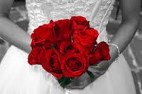
This image shows contrast that has been edited into a photo. The flowers have been enhanced by the use of a black and white background which causes the audiences eyes to focus on that specific part of the picture due to the contrast in colours.


This picture shows a contrast in both colour and subject, The flower stands out because it is the only one of its kind that is visible within the frame. This is further enhanced by the contrast in colours as the red is immediately more vibrant than the green.


Studio Contrast Work Diary


We were set with the task of photographing contrast in the studio. I went in with a number of ideas that i had in relation to the topic but i became very limited within the studio environment and found it quite difficult to portray it. I was still able to get a reasonable amount of pictures with a good variation in things like gender and height along with getting more experience with the studio. I was able to make the images more visually interesting by including some formal elements such as depth, colour and pattern.


This image shows contrast in an interesting way. The shot is composed in a way where one person fills most of the frame with her face while the other fills the frame with her body and it shows an obvious contrast in distance as a result. This image shows the formal element of depth. This is achieved by having someone in the foreground of the image and someone in the background and comparing his the appearance differs over different distances. The darker tones of the clothing create contrasts between the background, causing the people to stand out within the image.


This image shows a couple examples of contrast. The image features contrast in gender by showing two girls and one boy within the image.Height is shown by having the women standing and the boy sitting, this can also be interpreted as to showing power as a result. There are contrasts of emotion within the image through the expressions on the people's faces. The dark clothing and bright hair colour create contrasts against the light background. This causes the people to stand out within the image.


Progression:

If i were to do this again i would think more about the environment that i will be shooting in when thinking about the photos that i want to take. I would also like to still achieve the good variation in pictures while obtaining a larger amount than i was previously able to achieve. The studio has allowed me to consider different backgrounds and the way that they can be used in order to show contrast in interesting ways.